Germany · taz · 7h
UN resolution for better world maps: A question of worldview
Deutsch (original) · Auto-translated to English
T he earth is not flat. No two-dimensional representation of the world accurately reflects three-dimensional reality. Cartographers have faced this dilemma in different ways for centuries. But world maps should have as precise a connection to reality as possible; that has actually been the consensus since the Renaissance. You might think this is quite simple - but it's not. Anyone who has ever looked at a globe will immediately notice how different the world appears than on any flat world map.
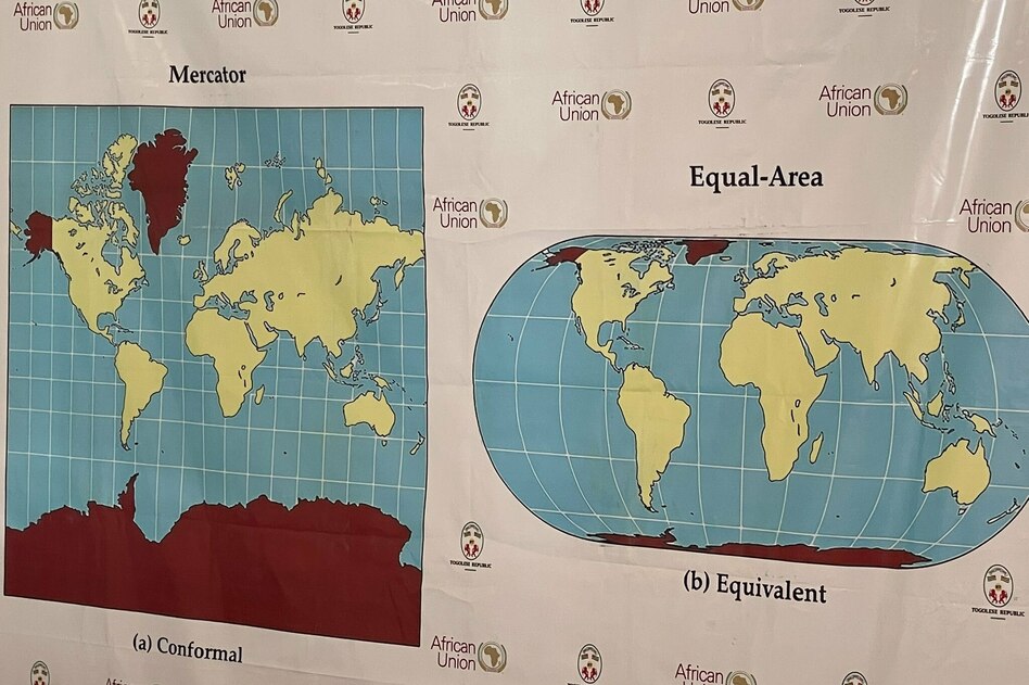
Antarctica and Greenland are surprisingly tiny; huge Africa almost pushes its small northern neighbor Europe to the edge. On common European world maps, however, it is the other way around. The polar regions of the world are huge, Africa is shrinking to an appendage of Europe. On September 4th, the United Nations General Assembly approved a new international standard for world maps.
In the future, all countries and continents will be represented area-wise. The “Equal Earth Projection” is intended to correct what almost all world maps have been doing wrong: the further a country is from the equator, the larger it appears. The most famous international standard, the so-called Mercator projection, is the most extreme example. It makes Greenland the size of Africa, and Europe extends over a similar area to its southern neighboring continent. Siberia is huge, Antarctica is a seemingly endless expanse.
It is somehow clear to most people that none of this can be exactly true. But how completely wrong it is astonishes almost everyone who is pointed out. Africa is actually 14 times larger than Greenland, which is just the size of Saudi Arabia. Africa is as big as Russia, China and the USA combined.
The Mercator projection, developed in 1569 for European seafaring, has the irreplaceable advantage in navigation that it is true to angles. A straight line on a Mercator map corresponds to a straight line on the globe. The trick: The lines of longitude are always parallel to each other on the map. In reality they converge at the two poles and diverge further and further towards the equator. At the equator, one degree of longitude corresponds to a distance of 60 nautical miles, around 111.3 kilometers. At the north and south poles the distance is zero.
At the equator, the actual circumference of the Earth is around 40,075 kilometers. At the 50th parallel, where Mainz is located, for example, there are around 25,730, at the 70th parallel, near which the northern coasts of Alaska and Canada run, there are only around 13,700. But on a Mercator map, all of these distances are the same. To make this possible, the latitudes are being moved further and further apart and the areas depicted are becoming larger and larger.
Shipping and aviation need conformal maps. But maps are not only a means of navigation, they also contain a representation of the world. Different means are needed for different purposes. A distorted image of the world produces a distorted worldview. Would so many people think Russia is overwhelmingly all-powerful if they could see that the country actually fits into Africa's Sahara and Sahel?
Would US President Donald Trump so persistently claim Greenland if he knew that in reality it is not a continent the size of Africa centrally located between America and Europe, but an island smaller than Algeria on the northeastern edge of Canada? There have been many attempts to break away from the Mercator projection, which was perceived as imperial, and from around the 1970s it became increasingly rare.
But then came the internet. Google Maps and similar cartographic services only work with Mercator, because this is the only way to zoom in and out without having to change anything else. This causes a gigantic regression for people who only believe that what they can see on their smartphone is reality. They see the world again in imperial contexts. You see the earth as a disk.
“The historical legacy of cartographic distortions of continental sizes has cognitive, educational, cultural, geopolitical and socio-economic implications,” says UN General Assembly Resolution 80/L.104. Togo submitted the text on behalf of the African Union. Togo's UN ambassador spoke of a step towards "greater understanding, respect and peace between nations". Only the USA voted against it. The reason given is that the project is part of a “radical ideological project”.
The debate was not free from discord. Because Crimea does not appear as part of Ukraine on the world map presented in New York - it does not appear as part of Russia, but has somehow become independent - Ukraine abstained, as did Estonia, Georgia, Lithuania and Moldova out of solidarity. And because it says Kosovo, Serbia abstained.
However, the project of countering the reintroduction of imperial worldviews by the big tech companies must not fail at national borders. Equal Earth's original map, developed in 2018, contains only geographical outlines. An initiative called “Correct The Map” has been drumming up better world maps for years. In Germany, the Development Ministry BMZ points out that it has been using Equal Earth since spring. France's Foreign Ministry has now announced this as a new standard. In the Foreign Office, however, you still see distorted maps, although the Mercator projection is rarely used. And there is also surprisingly stubborn resistance among journalists.
The UN resolution does not simply call for the general adoption of Equal Earth. It calls for “awareness raising in education, science and the media”. You can be excited.
Read the full story at the source →
Source: taz