
Germany taz
New design at Suhrkamp Library: Celebrate with colors
The Suhrkamp library is being completely renovated. Olaf Nicolai's cover idea leaves the old design rigor behind and yet continues the tradition. more...
Deutsch (original) ·Auto-translated to English
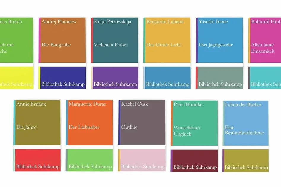
The Suhrkamp Library offers a representative stage, especially for texts that are not intended to be represented in the first place. This series has been around for 75 years now. It was founded in 1951 by Peter Suhrkamp, shortly after the publishing house began, and it now includes 1,565 books. There are classics among them, by Rilke (“Malte Laurids Brigge”), Joyce (“Portrait of the Artist as a Young Man”), Thomas Bernhard (“Frost”), and many, many others.
But the specific charm of the series comes from other books: the secondary works that turn out to be the real gems, the small masterpieces, the risky attempts, the discoveries. There are also a lot of these in the Suhrkamp library. Siegfried Kracauer's novel "Georg" has been published here again, Jürgen Habermas's small collection "From Sensual Impression to Symbolic Expression", which is also well-read, or Amos Oz's story "Herr Levi".
This series was and is by no means about canonization, at least it's not just about that, but about recommendations from readers for readers, that's what we're told implicitly. Look, this could be worth reading, the editions seem to tell you, not loudly, not blatantly, but matter-of-factly and with certainty.
That may sound a bit idealistic, and of course publishing considerations always play a role in the selection of the series, but overall the Suhrkamp library exudes something bibliophilic in the good sense of the word: it doesn't appear dusty, but rather application-oriented. To put it with Wolfgang Herrndorf (even if he is not a Suhrkamp author): You see the care and think of the love for it - the love for reading.
How do you celebrate the anniversary of a series like this? The solution that Suhrkamp Verlag came up with sounded reckless, almost like sacrilege, when we first heard about it. But now that you can hold the result in your hands, it turns out to be extremely successful: the publisher is celebrating it with colors. This is new. Take a look at the slipcase that Suhrkamp released for the 50th anniversary; All 15 volumes shine in pure white, discreetly decorated with just one colored bar on the cover.
The 10 volumes that have now come out for the 75th anniversary, plus the anthology “Life of Books” edited by Katharina Rabe and Frank Wegner with texts about writing and reading, instead each have six colors (plus the white of the font) if you take the front and back of the cover together. On the one hand, the redesign is a clear break with tradition; monochrome was previously part of the identity of the series.
On the other hand, this redesign also continues the tradition because the seriousness set by the legendary designer Willy Fleckhaus continues to be conveyed. Like the strict Fleckhaus designs, the different color combinations with repeating divisions of the areas also have something of Bauhaus about them - and they look beautiful.
Now it's not just any colors. The publisher thought about the concept together with the artist Olaf Nicolai and is now spending a lot on the production of the books; these covers are certainly not cheap. Years ago, Olaf Nicolai put together 30 colors for an exhibition from the almost 2,500 colors of the Pantone color spectrum, from which the covers of the volumes are now combined.
As with Fleckhaus, these covers are in no way intended to illustrate the content of the book. At the same time, they make the series recognizable even in the differences between the individual issues. What's more: These covers also have something sensually playful about them.
Suhrkamp doesn't just distribute color areas here, but rather convincingly points out that readers have to be taken seriously - and actually takes them seriously. When you open the books in the series, you immediately see a pleasant, classic typeface that you are happy about for a moment, but then forget as soon as you immerse yourself in the text.
So these editions not only look great on the shelf, but also have a high practical value. One would like to immediately congratulate the texts that appear in this newly designed series; But they also have to show that they have what it takes. That's how it should be.